Our Work
Ten full, clickable concept websites we designed for different kinds of business, so you can see exactly what we build before you book. Every one is built around the business, not a template dressed up to look custom.
Real Work
Real sites you can visit right now, from my own brands to businesses I've built for.
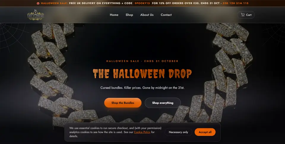
My own UK jewellery brand: a full online shop with product pages, a cart, secure Stripe checkout and seasonal sales.
Visit yrbsupreme.com →
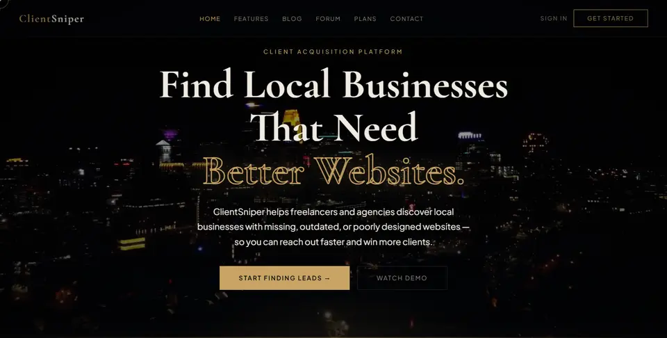
My own lead-finding platform that helps freelancers and agencies find local businesses with missing or outdated websites.
Visit clientsniperofficial.com →
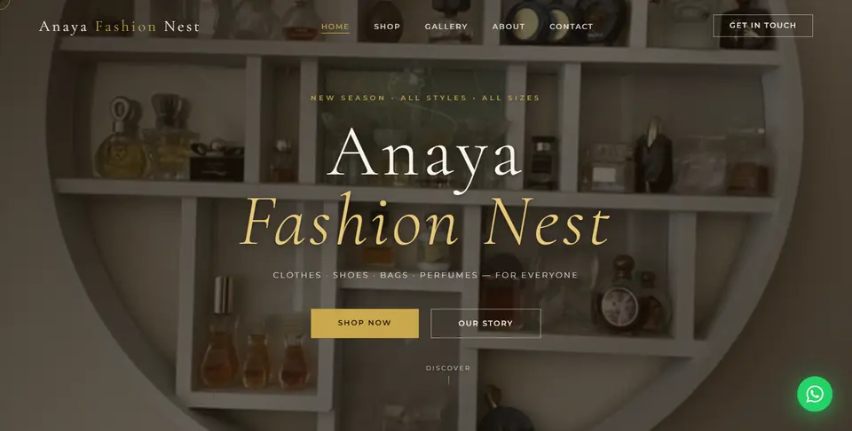
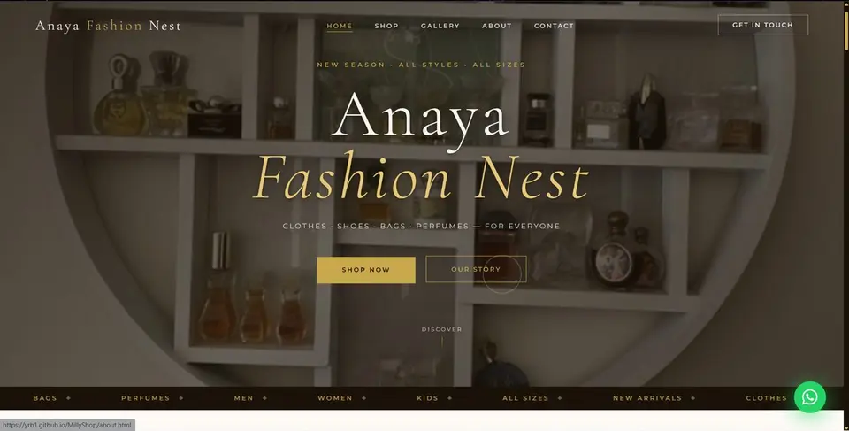
A boutique website for a clothes, shoes, bags and perfume shop in Kampala, Uganda, with a shop, gallery and WhatsApp contact.
Visit the live site →
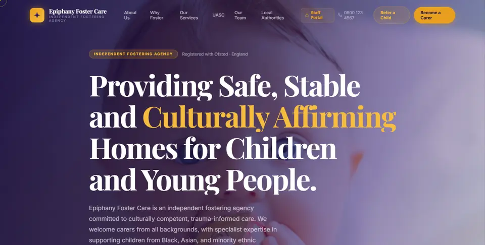
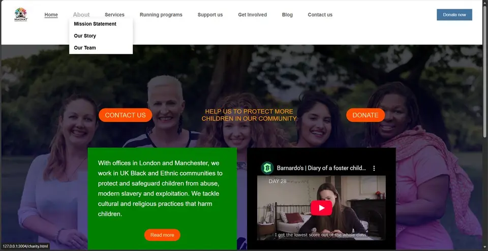
A website for an independent fostering agency, with information for foster carers, referral routes for local authorities and a staff portal.
Visit the live site →
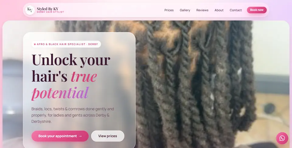
A website for an Afro and black hair stylist in Derby, with prices, a gallery, reviews and online booking.
Visit the live site →
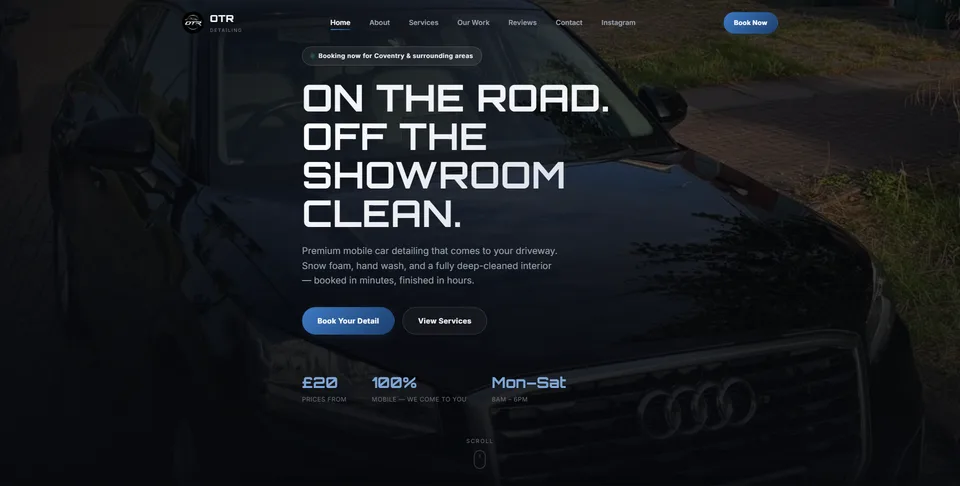
A fast, mobile-first website for a mobile car detailer in Coventry, with services and prices, a gallery of real jobs and video reels, and customer reviews.
Visit otrdetailinguk.com →
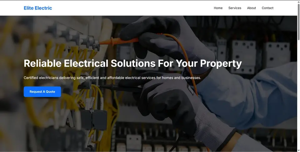
The brief: a local electrical business needed a site that built trust with homeowners fast, made services clear at a glance, and turned page visits into phone calls.
We built a clean, credibility-first layout with service breakdowns, clear calls-to-action, and a mobile-first design, since most enquiries were coming from phones.
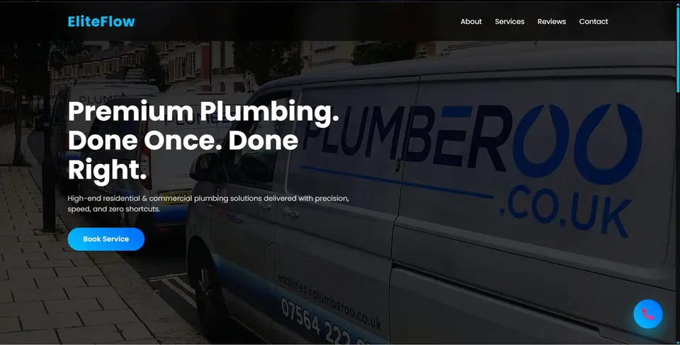
The brief: this plumbing business was relying entirely on word of mouth with no online presence at all. We built a professional site from scratch, showcasing services, booking, and contact features in one clear flow.
The goal: make it effortless for a stressed customer with a leaking pipe to find what they need and get in touch immediately.
The brief: a clothing brand needed a website that could actually showcase products properly and guide customers through a seamless shopping experience, without feeling like a generic store template.
We focused on clean product presentation, fast page loads, and a layout that puts the clothing front and centre.
The brief: a straightforward, user-friendly donation page designed to make supporting the cause simple and accessible on any device, with no unnecessary steps between a visitor and a donation.
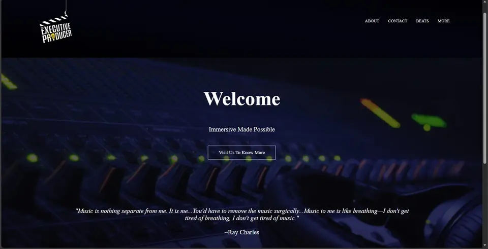
The brief: a clean, focused portfolio built to showcase work clearly and reflect the artist's style and brand, without competing with the music itself for attention.
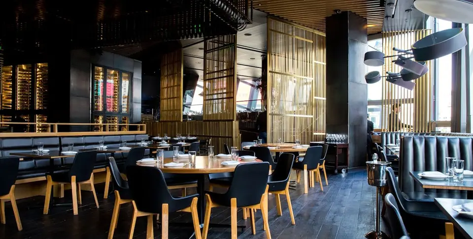
The brief: a fire-led restaurant needed a site that matched the intensity of the room: dark, confident, and menu-first, with reservations front and centre.
We built a moody, editorial layout with a rotating hero, signature dish highlights, and a straight line to booking a table.
The brief: a residential agency needed a site that felt as premium as the homes it sells, with listings that presented properly instead of looking like a generic template.
We designed a navy-and-gold luxury aesthetic with a featured listings grid, agent credibility section, and a clear path to booking a viewing.
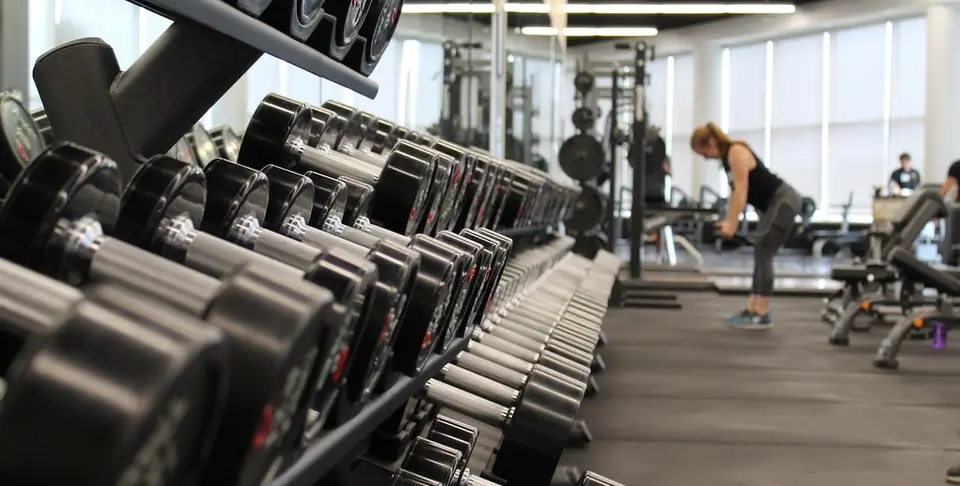
The brief: a gym wanted a site with the same energy as walking through the door: bold, dark, and built to convert visitors into free-trial sign-ups.
We built a high-contrast layout with class breakdowns, transparent membership tiers, and member results front and centre.
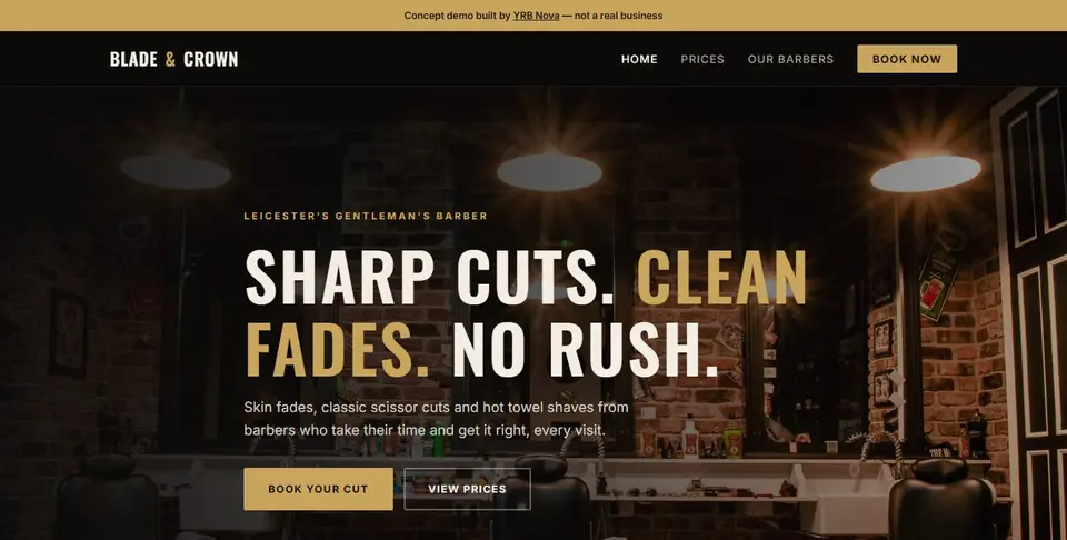
The brief: a barber shop wanted to stop losing customers to phone tag and walk-in queues, and to look as sharp online as the cuts they deliver.
We built a moody, premium design with a clear price list, barber profiles, and a working four-step online booking flow with live time slots and instant confirmation.
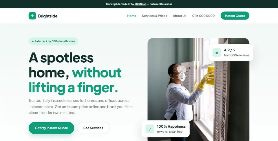
The brief: a cleaning company was spending hours on the phone giving quotes. They wanted customers to see a price and book without waiting for a call-back.
We built a bright, trust-first site with an instant quote calculator: pick the clean type, home size, frequency and extras, and the price updates live.
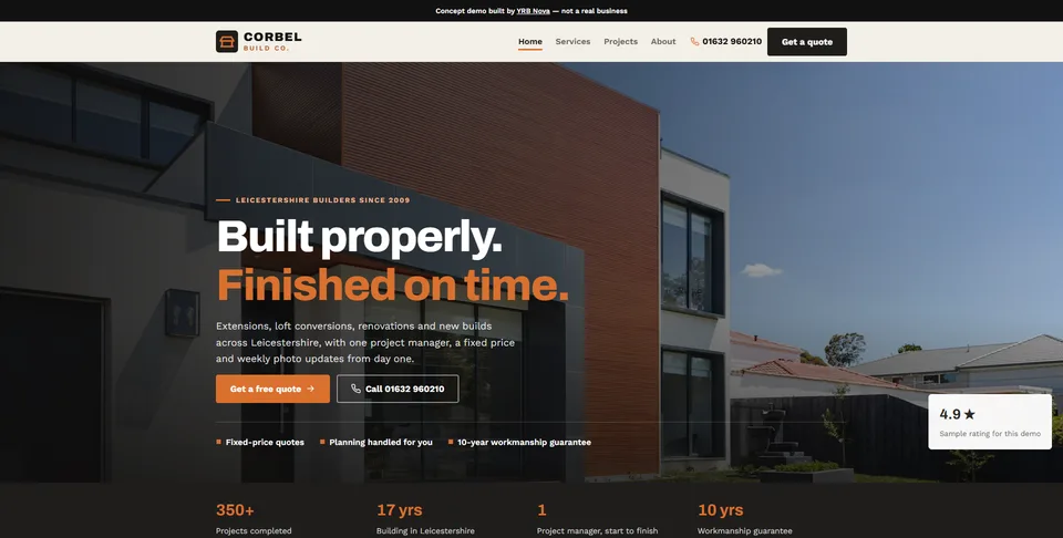
The brief: a Leicestershire building firm wanted bigger, better-qualified enquiries for extensions and lofts, instead of tyre-kickers asking for a "rough price".
We built a bold, architectural site with drag-to-compare before-and-after case studies and a five-step quote form that captures project type, budget, timeline and postcode before anyone picks up the phone.
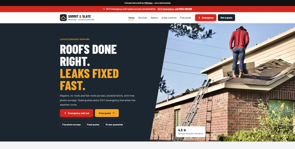
The brief: a roofer was missing emergency jobs to whoever answered first, and wasting site visits on small repairs that could be priced from a photo.
We built a high-contrast site with a 24/7 emergency call button on every screen, an areas-covered postcode checker, a job gallery and a quote form where customers upload photos of the problem.
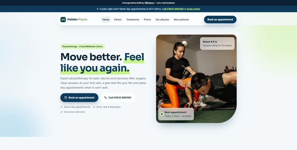
The brief: a four-clinic physio group across the East Midlands needed one site that books patients into any clinic, day or night, and catches people in pain before they call a competitor.
We built a fresh, sporty multi-clinic site with a postcode clinic finder, clear "from" prices, five treatment pages, same-day appointments, online booking and an AI receptionist that hands red-flag calls to a clinician.
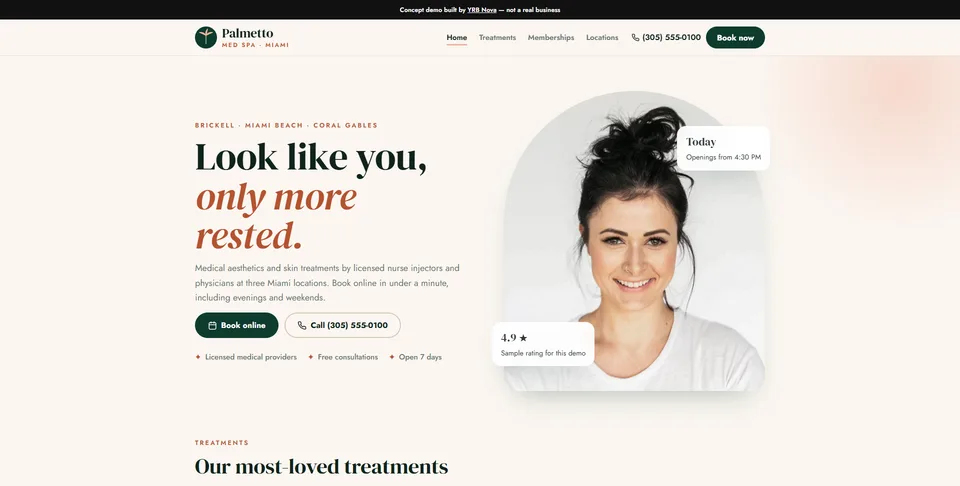
The brief: a three-location Miami med spa wanted to turn late-night Instagram browsers into booked appointments and recurring monthly members.
We built a tropical-luxe site in US format with transparent "from" pricing, location pages, three membership tiers, a four-step online booking flow and a Sales Mode that explains why every feature earns its place.
Tell us about your project and we'll get back to you within one business day.